Upbrand
Introduction
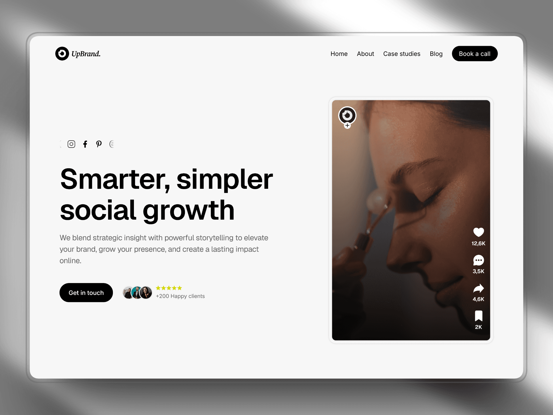
The Upbrand Website Project is a modern digital agency website designed to showcase branding and design services through a clean and visually engaging interface. The objective of the project was to create a website that communicates brand identity, services, and creative capabilities in a structured and compelling way.
The project started with interface planning and layout exploration in Figma, where the structure, grid system, and visual hierarchy were defined. Once the design direction was finalized, the website was developed in Framer, allowing the design to evolve into a fully responsive and interactive website.
The final result is a modern branding website that combines minimal design, strong typography, and clear content structure to create a professional digital presence for a creative agency.
Client
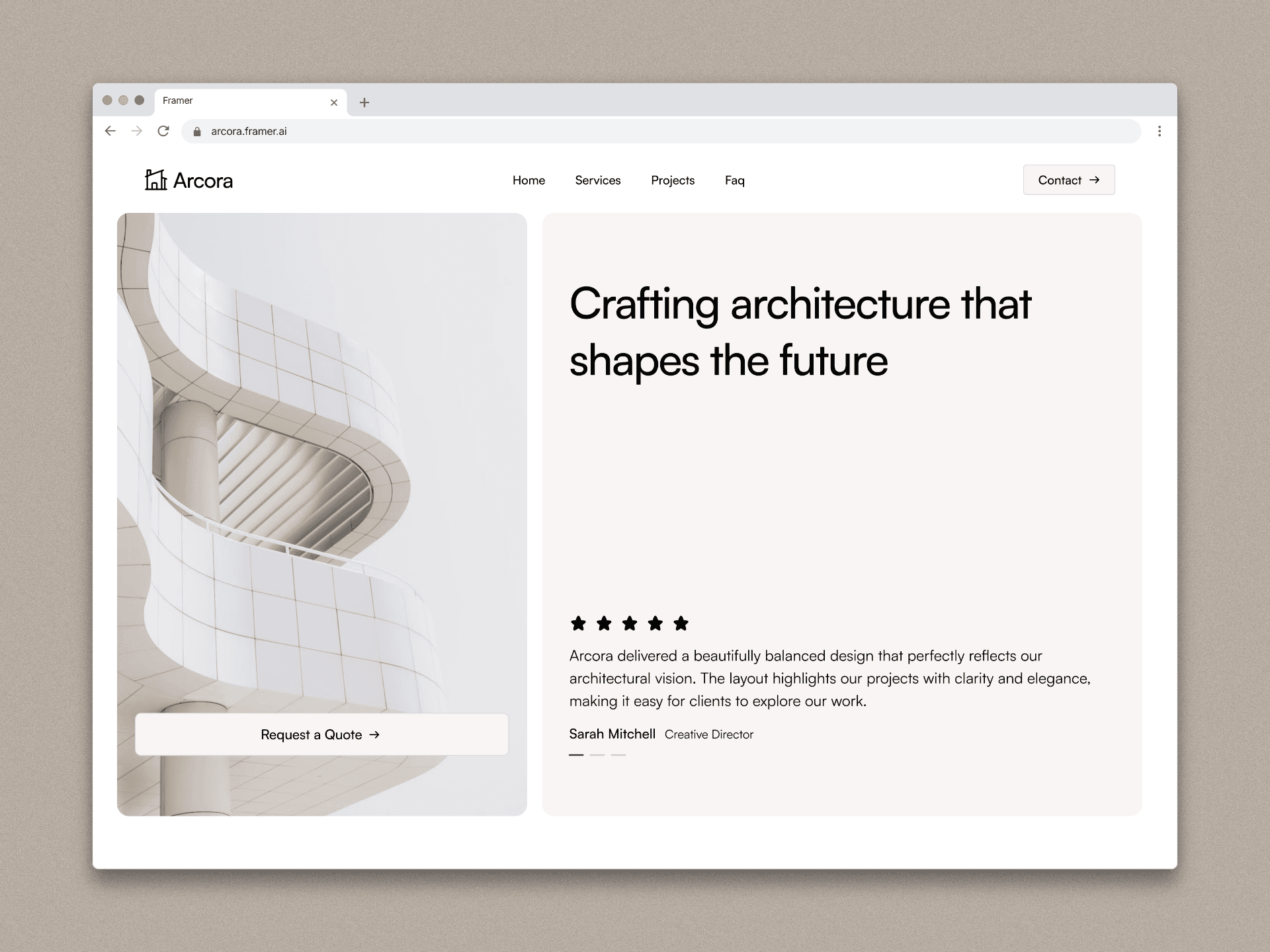
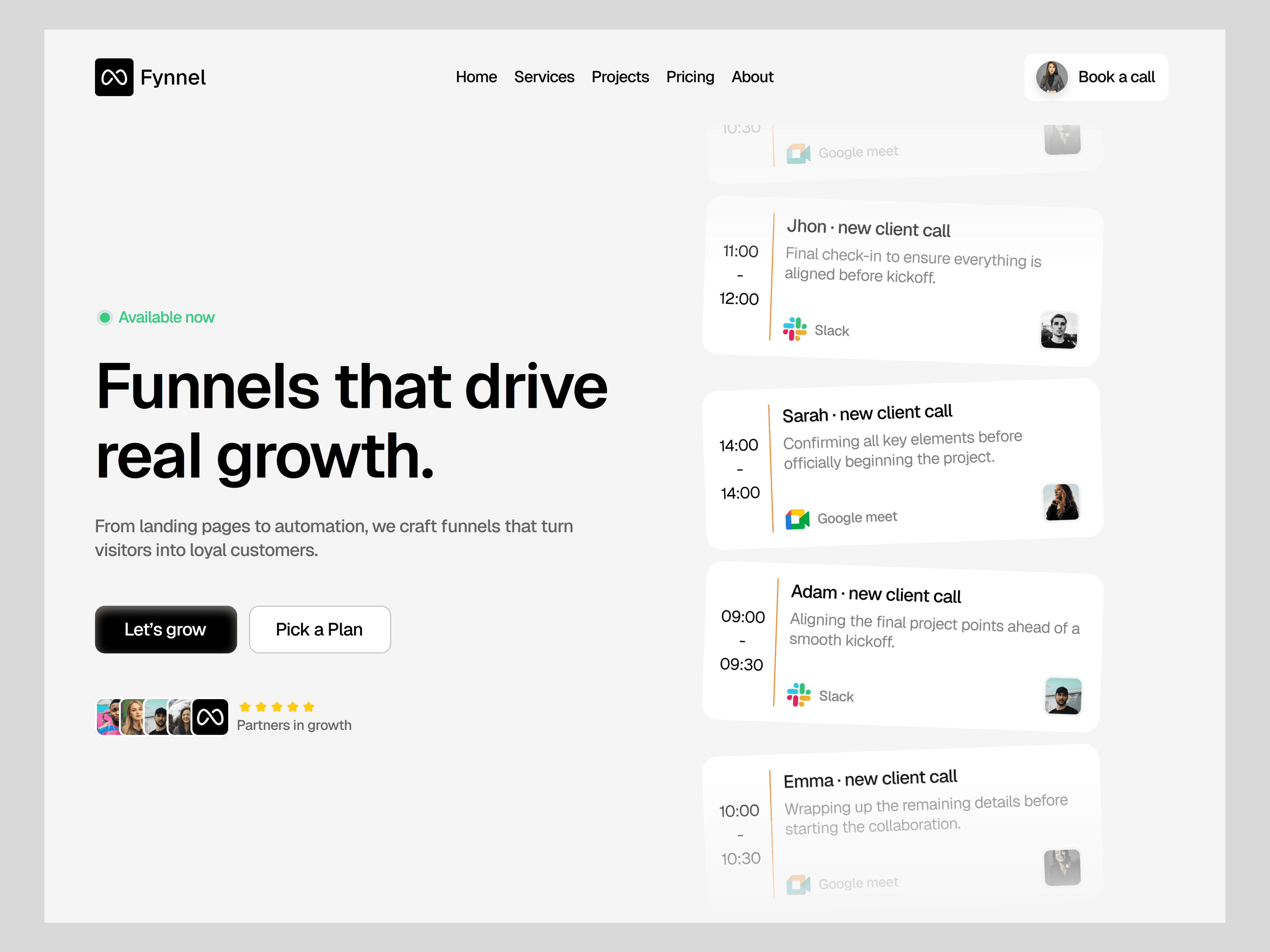
Framer client
Services
Web design
Timeline
4 weeks
Project Goal
The main goal of the Upbrand project was to design a modern website capable of presenting branding services in a visually impactful and user-friendly way.
The project focused on several objectives:
• Creating a strong brand-focused visual identity
• Structuring content to clearly present services and expertise
• Designing a conversion-focused layout that encourages potential clients to contact the agency
• Ensuring the website is fully responsive across all devices
• Developing a scalable layout system for future updates and content expansion
Another key objective was to establish an efficient workflow combining Figma for interface design and Framer for development, allowing the design to be transformed into a live website quickly and accurately.
Framer is widely used by designers because it enables building responsive and interactive websites visually without heavy coding.
Process
1. Research & Planning
The project began with research into modern branding and creative agency websites to understand how studios present their services and creative work online.
The research focused on several aspects:
• Visual identity and branding presentation
• Portfolio and project showcase structures
• Conversion-focused landing page layouts
• Typography and visual storytelling
Based on these insights, a clear website structure was defined to guide the user experience:
Home
Services
Work / Projects
About
Contact
This structure ensures users can quickly understand what the agency offers and explore its creative capabilities.
2. Wireframing
The next step was creating low-fidelity wireframes in Figma to define the layout structure and content hierarchy.
The wireframes focused on organizing the key sections of the website, including:
• Hero section presenting the agency’s value proposition
• Service overview sections
• Portfolio or project showcase
• Testimonials or credibility elements
• Clear call-to-action sections
At this stage the focus was primarily on usability and content organization, rather than visual design.
3. UI Design & Design System
Once the wireframes were validated, the interface design phase began.
A consistent design system was created to ensure visual harmony across the website.
The design system included:
Typography
A modern and clean type hierarchy was implemented to clearly separate headlines, subheadings, and body text.
Color Palette
A minimal and brand-oriented color palette was used to reinforce the identity of the agency while maintaining readability.
Layout System
A grid-based layout with generous spacing was implemented to improve visual clarity and create a balanced composition across all sections.
The design emphasizes simplicity and strong visual storytelling, allowing the branding work and services to stand out.
4. Prototyping
Interactive prototypes were built in Figma to simulate user navigation and interactions across the website.
The prototype helped validate:
• Navigation structure
• Section flow and readability
• User engagement with service sections
• Placement of call-to-action elements
This step ensured that the user journey was clear and intuitive before moving into development.
5. Development in Framer
After finalizing the design, the website was developed using Framer, a visual website builder widely used by designers to build modern websites without complex coding.
Key implementation steps included:
• Building reusable components for consistency
• Implementing responsive layouts for multiple screen sizes
• Adding subtle animations and transitions
• Optimizing typography and spacing
• Integrating forms and call-to-action elements
Framer enabled rapid development while maintaining design accuracy and performance.
6. Responsive Optimization
Ensuring responsiveness was an important step in the project.
The layout was optimized for:
• Desktop screens
• Tablets
• Mobile devices
Each section was adjusted to maintain readability, spacing, and visual balance across different screen sizes.
Outcome
The final result is a modern and visually engaging branding agency website that effectively communicates services, expertise, and brand identity.
The website successfully combines strong visual design, clear content hierarchy, and responsive layouts to create a seamless user experience.
Using Figma for the design process and Framer for development enabled an efficient workflow that allowed the project to move quickly from concept to live website.


Conclusion
The Upbrand project demonstrates how a structured design workflow can transform an initial concept into a polished and professional website.
Starting with research and wireframing helped establish a strong foundation for the user experience. Designing in Figma allowed efficient exploration of layouts and visual styles, while development in Framer enabled the design to become a fully responsive and interactive website.
This workflow highlights how modern design tools can streamline the process from idea to launch while maintaining design quality and scalability.
Upbrand
Introduction
The Upbrand Website Project is a modern digital agency website designed to showcase branding and design services through a clean and visually engaging interface. The objective of the project was to create a website that communicates brand identity, services, and creative capabilities in a structured and compelling way.
The project started with interface planning and layout exploration in Figma, where the structure, grid system, and visual hierarchy were defined. Once the design direction was finalized, the website was developed in Framer, allowing the design to evolve into a fully responsive and interactive website.
The final result is a modern branding website that combines minimal design, strong typography, and clear content structure to create a professional digital presence for a creative agency.
Client
Framer client
Services
Web design
Timeline
4 weeks
Project Goal
The main goal of the Upbrand project was to design a modern website capable of presenting branding services in a visually impactful and user-friendly way.
The project focused on several objectives:
• Creating a strong brand-focused visual identity
• Structuring content to clearly present services and expertise
• Designing a conversion-focused layout that encourages potential clients to contact the agency
• Ensuring the website is fully responsive across all devices
• Developing a scalable layout system for future updates and content expansion
Another key objective was to establish an efficient workflow combining Figma for interface design and Framer for development, allowing the design to be transformed into a live website quickly and accurately.
Framer is widely used by designers because it enables building responsive and interactive websites visually without heavy coding.
Process
1. Research & Planning
The project began with research into modern branding and creative agency websites to understand how studios present their services and creative work online.
The research focused on several aspects:
• Visual identity and branding presentation
• Portfolio and project showcase structures
• Conversion-focused landing page layouts
• Typography and visual storytelling
Based on these insights, a clear website structure was defined to guide the user experience:
Home
Services
Work / Projects
About
Contact
This structure ensures users can quickly understand what the agency offers and explore its creative capabilities.
2. Wireframing
The next step was creating low-fidelity wireframes in Figma to define the layout structure and content hierarchy.
The wireframes focused on organizing the key sections of the website, including:
• Hero section presenting the agency’s value proposition
• Service overview sections
• Portfolio or project showcase
• Testimonials or credibility elements
• Clear call-to-action sections
At this stage the focus was primarily on usability and content organization, rather than visual design.
3. UI Design & Design System
Once the wireframes were validated, the interface design phase began.
A consistent design system was created to ensure visual harmony across the website.
The design system included:
Typography
A modern and clean type hierarchy was implemented to clearly separate headlines, subheadings, and body text.
Color Palette
A minimal and brand-oriented color palette was used to reinforce the identity of the agency while maintaining readability.
Layout System
A grid-based layout with generous spacing was implemented to improve visual clarity and create a balanced composition across all sections.
The design emphasizes simplicity and strong visual storytelling, allowing the branding work and services to stand out.
4. Prototyping
Interactive prototypes were built in Figma to simulate user navigation and interactions across the website.
The prototype helped validate:
• Navigation structure
• Section flow and readability
• User engagement with service sections
• Placement of call-to-action elements
This step ensured that the user journey was clear and intuitive before moving into development.
5. Development in Framer
After finalizing the design, the website was developed using Framer, a visual website builder widely used by designers to build modern websites without complex coding.
Key implementation steps included:
• Building reusable components for consistency
• Implementing responsive layouts for multiple screen sizes
• Adding subtle animations and transitions
• Optimizing typography and spacing
• Integrating forms and call-to-action elements
Framer enabled rapid development while maintaining design accuracy and performance.
6. Responsive Optimization
Ensuring responsiveness was an important step in the project.
The layout was optimized for:
• Desktop screens
• Tablets
• Mobile devices
Each section was adjusted to maintain readability, spacing, and visual balance across different screen sizes.
Outcome
The final result is a modern and visually engaging branding agency website that effectively communicates services, expertise, and brand identity.
The website successfully combines strong visual design, clear content hierarchy, and responsive layouts to create a seamless user experience.
Using Figma for the design process and Framer for development enabled an efficient workflow that allowed the project to move quickly from concept to live website.
Conclusion
The Upbrand project demonstrates how a structured design workflow can transform an initial concept into a polished and professional website.
Starting with research and wireframing helped establish a strong foundation for the user experience. Designing in Figma allowed efficient exploration of layouts and visual styles, while development in Framer enabled the design to become a fully responsive and interactive website.
This workflow highlights how modern design tools can streamline the process from idea to launch while maintaining design quality and scalability.