Arcora
Introduction
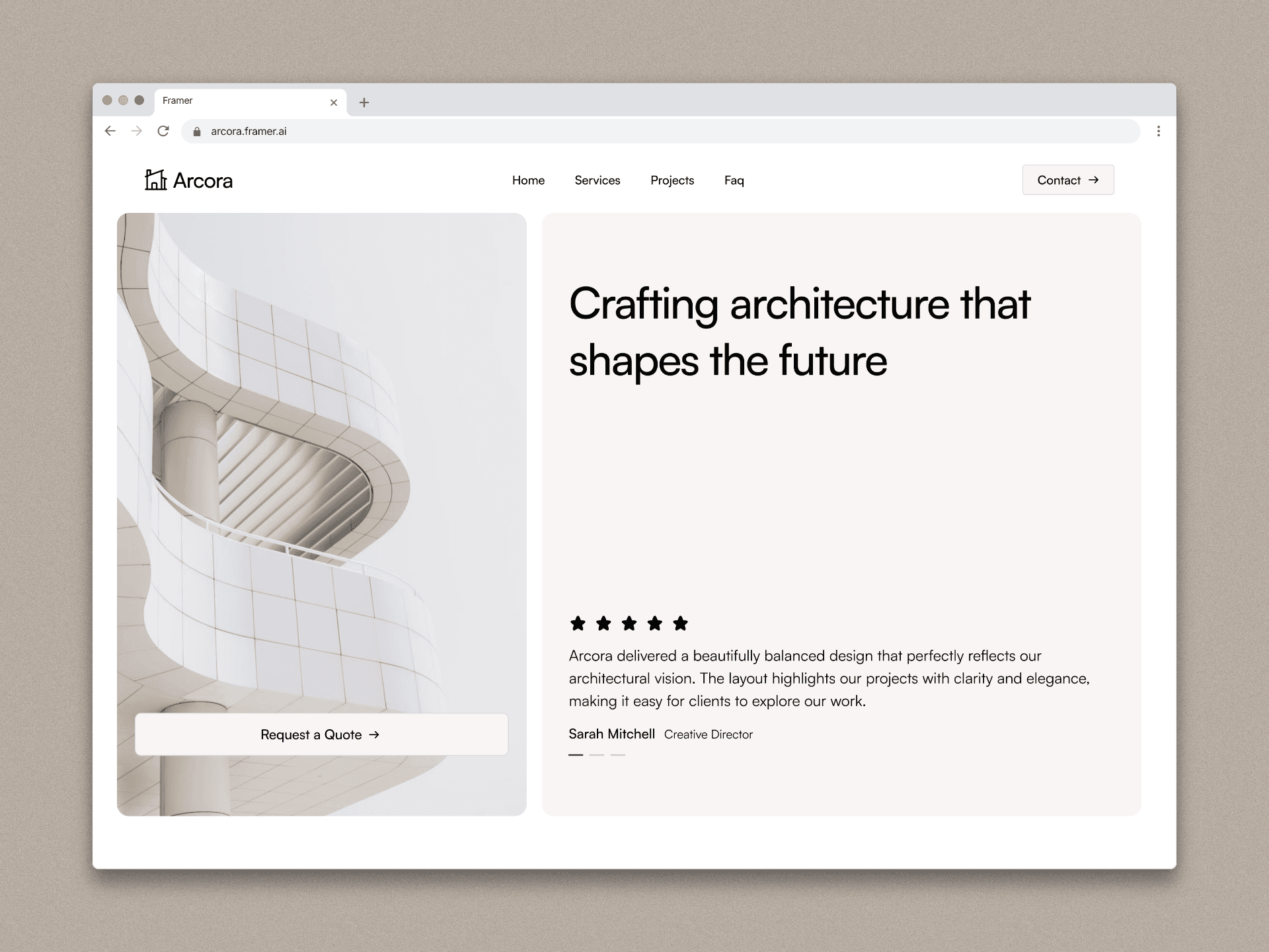
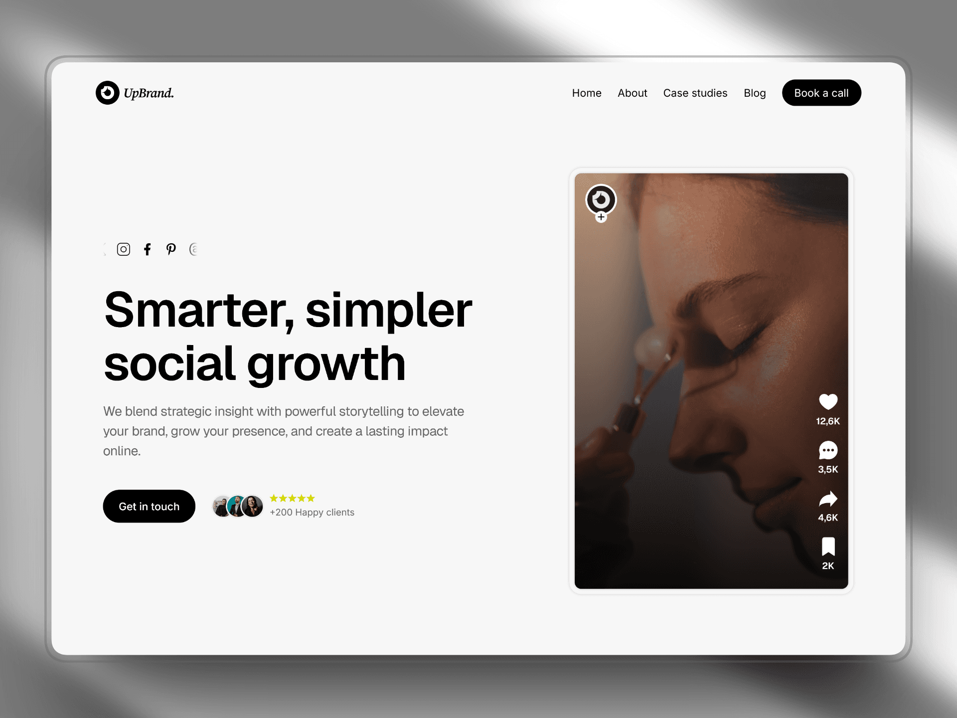
Arcora is a modern architecture portfolio website designed to present architectural projects in a clear, elegant, and immersive digital experience. The goal of the project was to design a platform that allows architecture studios to showcase their work with strong visual storytelling while maintaining a clean and professional interface.
The project began with UX planning and interface design in Figma, where the structure, layout system, and visual hierarchy were created. After validating the design system and user flow, the website was developed in Framer, allowing the design to be transformed into a responsive and interactive website.
The result is a minimalist architecture portfolio that balances strong visual presentation with usability, giving visitors a seamless way to explore projects and learn about the studio's work.
Client
Framer template
Services
Web design and Framer developer
Timeline
2 weeks
Project Goal
The main objective of Arcora was to create a digital experience that highlights architectural projects while maintaining clarity and ease of navigation.
The key goals included:
• Designing a minimal and modern interface that reflects architectural aesthetics.
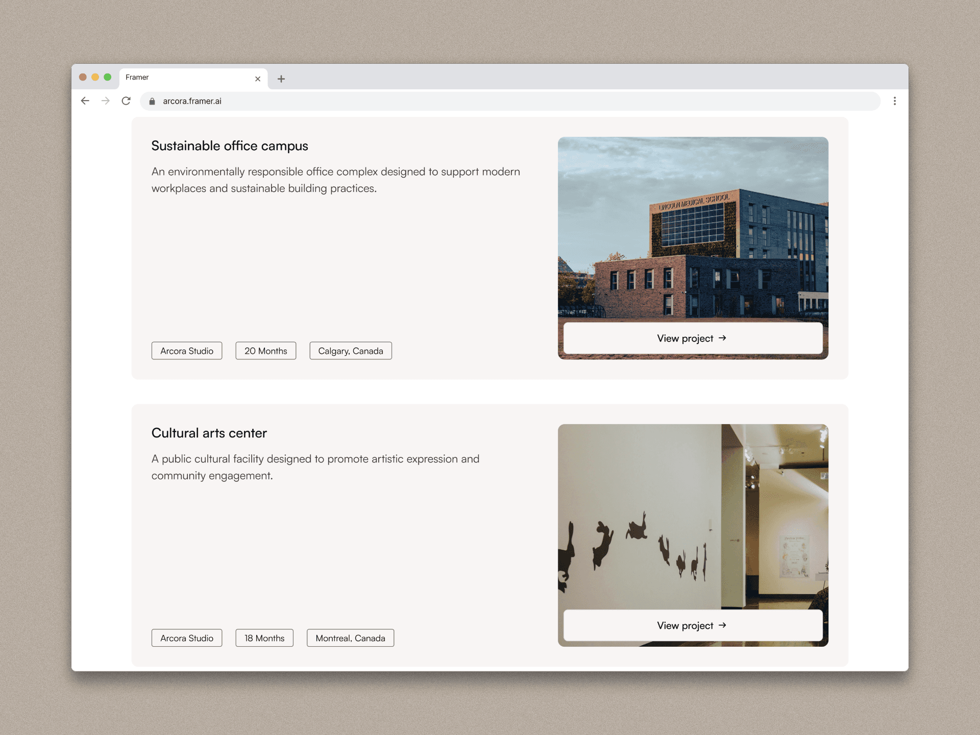
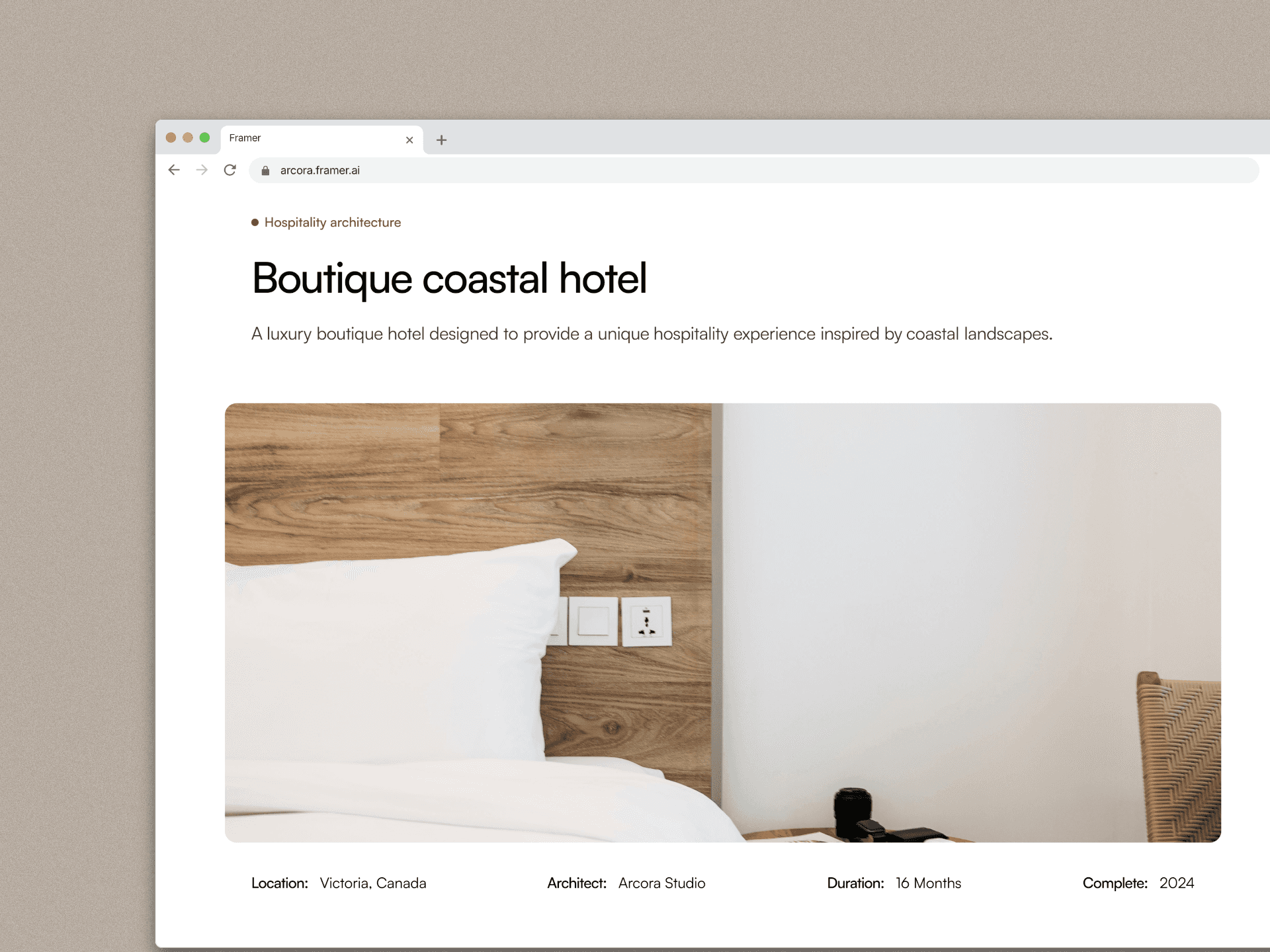
• Creating a structured portfolio system where projects can be explored easily.
• Ensuring the website is fully responsive across devices.
• Developing a scalable design system for future content and projects.
• Delivering smooth interactions and transitions to enhance the user experience.
Another important goal was to build the website using a workflow that combines design flexibility in Figma with rapid development in Framer, allowing the final product to stay visually consistent with the original design.
Process
1. Research & Planning
The project started with research into modern architecture portfolio websites. The objective was to understand how studios present their work and how users explore architectural projects online.
Key aspects analyzed included:
• Layout structures used in architecture websites
• Navigation patterns for project exploration
• Typography and visual hierarchy
• Image presentation and storytelling
Based on these observations, a simple and clear website structure was defined:
Home
Projects
Project Details
About
Contact
This structure ensures users can easily discover projects and understand the studio's design philosophy.
2. Wireframing (Figma)
Once the structure was defined, low-fidelity wireframes were created in Figma to establish the layout and content hierarchy.
The wireframes focused on:
• Hero section for visual impact
• Project grid layout for browsing
• Detailed project pages with strong imagery
• Clear navigation and spacing
At this stage the goal was not visual design but content organization and usability.
3. UI Design & Design System
After validating the wireframes, the interface design was developed.
A minimal design system was created including:
Typography
Modern sans-serif font
Clear hierarchy for titles and content
Color palette
Neutral tones
High contrast for readability
Layout system
Large spacing
Grid-based structure
Image-focused composition
The design emphasized simplicity and clarity, allowing the architectural projects to remain the visual focus.
4. Prototyping
Interactive prototypes were built in Figma to simulate how users would navigate through the website.
This helped test:
• Navigation flow
• Project browsing experience
• Content readability
• Page transitions
The prototype allowed early validation before moving to development.
5. Development in Framer
After finalizing the design, the website was built using Framer.
Framer enabled the design to be translated into a responsive website with modern interactions.
Key implementation steps included:
• Building responsive layouts for desktop and mobile
• Creating reusable components
• Implementing project pages with CMS structure
• Adding smooth transitions and animations
• Optimizing layout spacing and typography
Using Framer also allowed rapid iteration and visual adjustments during development.
6. Responsive Optimization
Special attention was given to responsiveness to ensure the website works across devices.
The layout was optimized for:
• Desktop screens
• Tablets
• Mobile devices
Images and content blocks were adjusted to maintain visual balance and readability across all screen sizes.
Outcome
The final result is a modern architecture portfolio website that combines minimal design with strong visual storytelling.
Arcora successfully demonstrates how architectural work can be presented online with clarity, elegance, and a seamless user experience.
The combination of Figma for design and Framer for development allowed the project to maintain visual consistency while achieving a fast and responsive final product.

Conclusion
The Arcora project highlights the importance of a structured design process when building digital experiences.
Starting with research and wireframing helped define a strong foundation for the interface, while the use of Figma enabled efficient design exploration and prototyping. Moving into Framer allowed the design to evolve into a fully functional website with responsive layouts and interactive elements.
This workflow demonstrates how modern design tools can streamline the process from concept to implementation, resulting in a polished and scalable architecture portfolio.
Arcora
Introduction
Arcora is a modern architecture portfolio website designed to present architectural projects in a clear, elegant, and immersive digital experience. The goal of the project was to design a platform that allows architecture studios to showcase their work with strong visual storytelling while maintaining a clean and professional interface.
The project began with UX planning and interface design in Figma, where the structure, layout system, and visual hierarchy were created. After validating the design system and user flow, the website was developed in Framer, allowing the design to be transformed into a responsive and interactive website.
The result is a minimalist architecture portfolio that balances strong visual presentation with usability, giving visitors a seamless way to explore projects and learn about the studio's work.
Client
Framer template
Services
Web design and Framer developer
Timeline
2 weeks
Project Goal
The main objective of Arcora was to create a digital experience that highlights architectural projects while maintaining clarity and ease of navigation.
The key goals included:
• Designing a minimal and modern interface that reflects architectural aesthetics.
• Creating a structured portfolio system where projects can be explored easily.
• Ensuring the website is fully responsive across devices.
• Developing a scalable design system for future content and projects.
• Delivering smooth interactions and transitions to enhance the user experience.
Another important goal was to build the website using a workflow that combines design flexibility in Figma with rapid development in Framer, allowing the final product to stay visually consistent with the original design.
Process
1. Research & Planning
The project started with research into modern architecture portfolio websites. The objective was to understand how studios present their work and how users explore architectural projects online.
Key aspects analyzed included:
• Layout structures used in architecture websites
• Navigation patterns for project exploration
• Typography and visual hierarchy
• Image presentation and storytelling
Based on these observations, a simple and clear website structure was defined:
Home
Projects
Project Details
About
Contact
This structure ensures users can easily discover projects and understand the studio's design philosophy.
2. Wireframing (Figma)
Once the structure was defined, low-fidelity wireframes were created in Figma to establish the layout and content hierarchy.
The wireframes focused on:
• Hero section for visual impact
• Project grid layout for browsing
• Detailed project pages with strong imagery
• Clear navigation and spacing
At this stage the goal was not visual design but content organization and usability.
3. UI Design & Design System
After validating the wireframes, the interface design was developed.
A minimal design system was created including:
Typography
Modern sans-serif font
Clear hierarchy for titles and content
Color palette
Neutral tones
High contrast for readability
Layout system
Large spacing
Grid-based structure
Image-focused composition
The design emphasized simplicity and clarity, allowing the architectural projects to remain the visual focus.
4. Prototyping
Interactive prototypes were built in Figma to simulate how users would navigate through the website.
This helped test:
• Navigation flow
• Project browsing experience
• Content readability
• Page transitions
The prototype allowed early validation before moving to development.
5. Development in Framer
After finalizing the design, the website was built using Framer.
Framer enabled the design to be translated into a responsive website with modern interactions.
Key implementation steps included:
• Building responsive layouts for desktop and mobile
• Creating reusable components
• Implementing project pages with CMS structure
• Adding smooth transitions and animations
• Optimizing layout spacing and typography
Using Framer also allowed rapid iteration and visual adjustments during development.
6. Responsive Optimization
Special attention was given to responsiveness to ensure the website works across devices.
The layout was optimized for:
• Desktop screens
• Tablets
• Mobile devices
Images and content blocks were adjusted to maintain visual balance and readability across all screen sizes.
Outcome
The final result is a modern architecture portfolio website that combines minimal design with strong visual storytelling.
Arcora successfully demonstrates how architectural work can be presented online with clarity, elegance, and a seamless user experience.
The combination of Figma for design and Framer for development allowed the project to maintain visual consistency while achieving a fast and responsive final product.
Conclusion
The Arcora project highlights the importance of a structured design process when building digital experiences.
Starting with research and wireframing helped define a strong foundation for the interface, while the use of Figma enabled efficient design exploration and prototyping. Moving into Framer allowed the design to evolve into a fully functional website with responsive layouts and interactive elements.
This workflow demonstrates how modern design tools can streamline the process from concept to implementation, resulting in a polished and scalable architecture portfolio.