Fynnel
Introduction
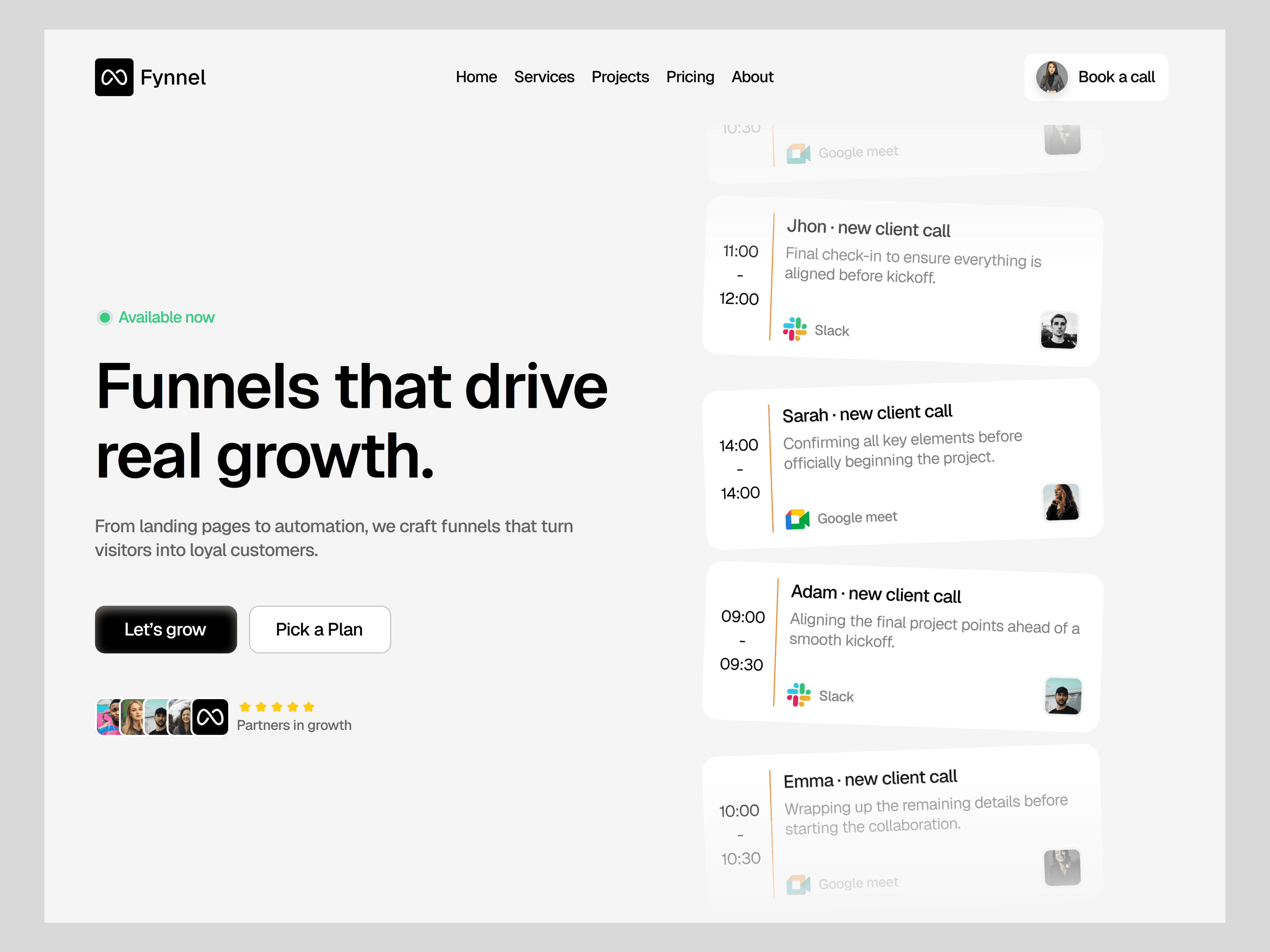
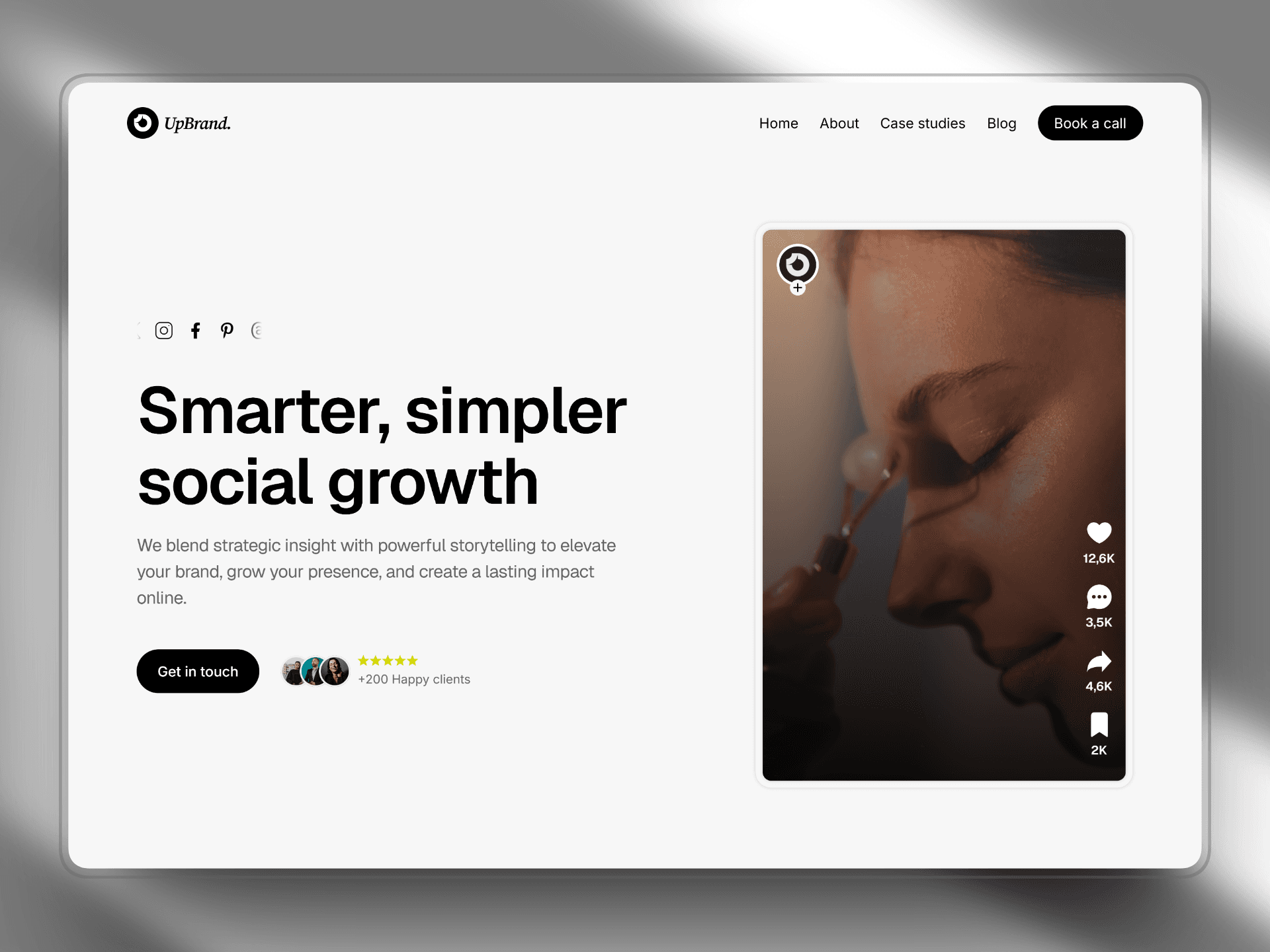
The Fynnel Website Project is a modern digital product website designed to present technology services and solutions through a clean and conversion-focused interface. The project focuses on delivering a professional web experience that communicates complex services in a clear and structured way while maintaining a modern visual style.
The design process started with interface planning and layout creation in Figma, where the overall structure, typography system, and component hierarchy were developed. Once the design direction was validated, the project moved into development using Framer, allowing the design to be transformed into a fully responsive and interactive website.
The final result is a modern digital business website that balances strong visual design with usability, enabling users to easily explore services, understand value propositions, and interact with the brand.
Client
Framer client
Services
Web design
Timeline
8 weeks
Project Goal
The goal of the Fynnel project was to design a modern website capable of presenting technology services in a clear and compelling way while guiding users toward taking action.
The key objectives included:
• Creating a modern and minimal interface suitable for technology and digital service companies
• Structuring content to clearly present services, solutions, and value propositions
• Designing a conversion-focused layout that encourages users to contact or request services
• Ensuring the website is fully responsive across desktop, tablet, and mobile devices
• Developing a scalable design system that supports future growth and additional content
Another important goal was to implement an efficient workflow that combines the flexibility of Figma for design with the rapid development capabilities of Framer.
Process
1. Research & Planning
The project started with research into modern technology and SaaS websites to understand how companies present their services online.
The research focused on:
• Layout structures used by technology companies
• Conversion-focused landing page patterns
• Clear service presentation
• Strong call-to-action placement
Based on this research, the main website structure was defined:
Home
About
Services
Case Studies
Contact
This structure ensures users can quickly understand what the company offers and easily navigate through the content.
2. Wireframing
Low-fidelity wireframes were created in Figma to define the content hierarchy and layout structure.
Key elements included:
• A strong hero section presenting the main value proposition
• Structured service sections explaining solutions
• Feature highlights and benefits
• Case studies or proof of work
• Clear contact and call-to-action areas
The goal during this phase was to focus on information architecture and usability before moving into visual design.
3. UI Design & Design System
Once the wireframes were validated, the user interface design was developed.
A modern design system was created to maintain visual consistency across the website.
The design system included:
Typography
Modern sans-serif fonts
Clear hierarchy for headings, subheadings, and content
Color System
Clean, modern color palette
Accent colors used to highlight actions and important content
Layout System
Grid-based structure
Balanced spacing
Content blocks designed for readability
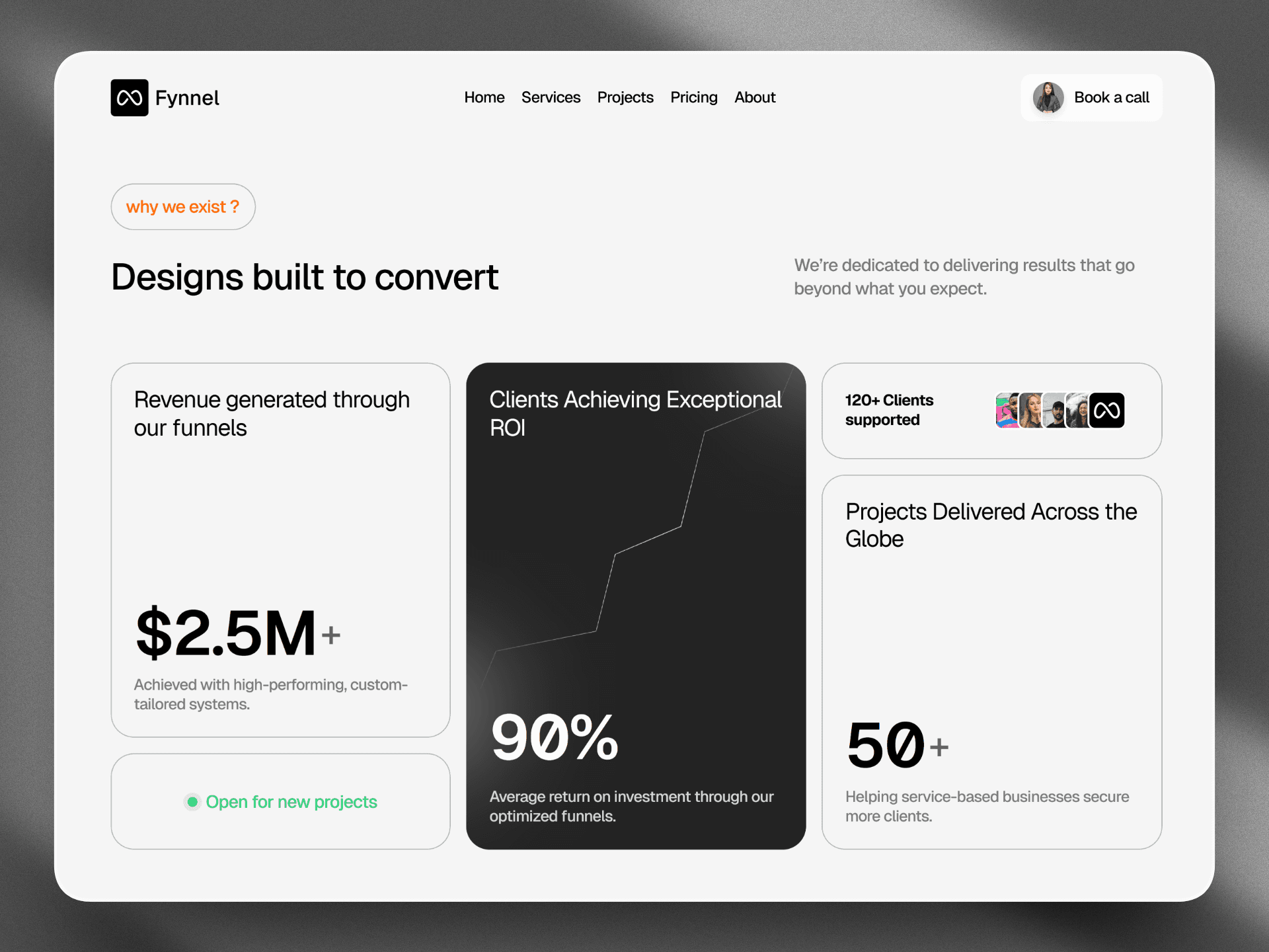
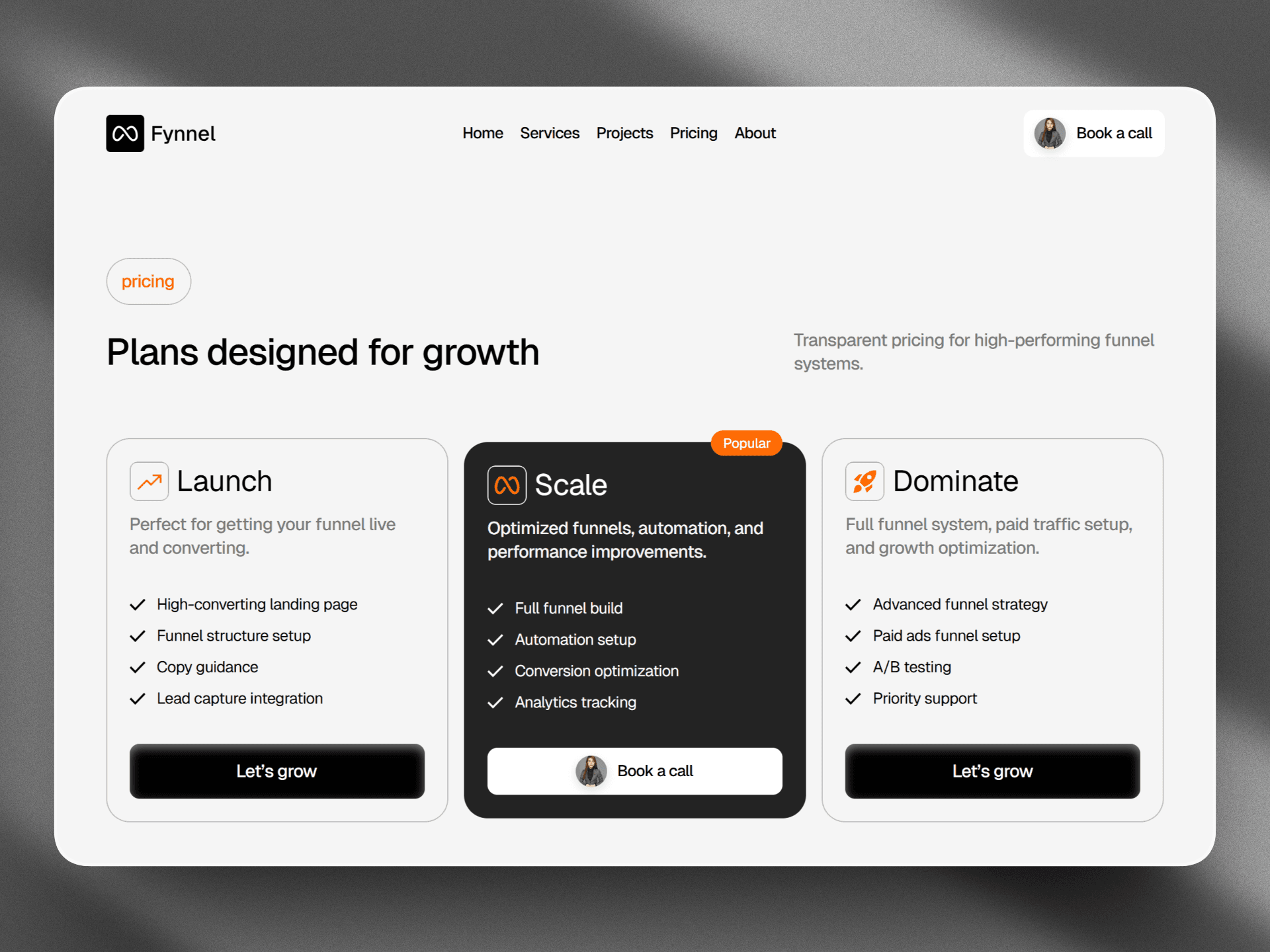
The visual style emphasizes clarity and professionalism, ensuring the website communicates technology services effectively.
4. Prototyping
Interactive prototypes were built in Figma to test how users would navigate the website.
The prototype helped validate:
• Navigation flow
• Content readability
• Service presentation
• User interaction with key sections
This step helped identify improvements before moving to the development phase.
5. Development in Framer
After the design phase was completed, the website was built using Framer.
Framer allowed the design to be translated into a functional website while maintaining design precision and responsiveness.
Key implementation steps included:
• Building reusable components
• Implementing responsive layouts for different screen sizes
• Adding smooth animations and transitions
• Optimizing layout structure and spacing
• Integrating forms and call-to-action elements
Framer’s visual development environment made it possible to iterate quickly while maintaining alignment with the original design.
6. Responsive Optimization
Ensuring responsiveness was a key part of the development process.
The layout was optimized for:
• Desktop screens
• Tablets
• Mobile devices
Content blocks, typography, and images were adjusted to maintain readability and visual balance across all devices.
Outcome
The final product is a modern digital business website that presents technology services in a structured and visually appealing way.
The website successfully combines a clean interface, clear content hierarchy, and modern interactions to create a professional digital experience.
The combination of Figma for design and Framer for development enabled an efficient workflow, allowing the project to move smoothly from concept to final implementation.

Conclusion
The Fynnel project demonstrates how a structured UX process can transform an initial concept into a fully functional digital product website.
Starting with research and wireframing ensured that the website’s structure supports user needs and business goals. Designing in Figma enabled efficient experimentation and prototyping, while development in Framer allowed the interface to evolve into a responsive and interactive website.
This process highlights the importance of combining design strategy with modern development tools to deliver scalable and user-focused digital experiences.
Fynnel
Introduction
The Fynnel Website Project is a modern digital product website designed to present technology services and solutions through a clean and conversion-focused interface. The project focuses on delivering a professional web experience that communicates complex services in a clear and structured way while maintaining a modern visual style.
The design process started with interface planning and layout creation in Figma, where the overall structure, typography system, and component hierarchy were developed. Once the design direction was validated, the project moved into development using Framer, allowing the design to be transformed into a fully responsive and interactive website.
The final result is a modern digital business website that balances strong visual design with usability, enabling users to easily explore services, understand value propositions, and interact with the brand.
Client
Framer client
Services
Web design
Timeline
8 weeks
Project Goal
The goal of the Fynnel project was to design a modern website capable of presenting technology services in a clear and compelling way while guiding users toward taking action.
The key objectives included:
• Creating a modern and minimal interface suitable for technology and digital service companies
• Structuring content to clearly present services, solutions, and value propositions
• Designing a conversion-focused layout that encourages users to contact or request services
• Ensuring the website is fully responsive across desktop, tablet, and mobile devices
• Developing a scalable design system that supports future growth and additional content
Another important goal was to implement an efficient workflow that combines the flexibility of Figma for design with the rapid development capabilities of Framer.
Process
1. Research & Planning
The project started with research into modern technology and SaaS websites to understand how companies present their services online.
The research focused on:
• Layout structures used by technology companies
• Conversion-focused landing page patterns
• Clear service presentation
• Strong call-to-action placement
Based on this research, the main website structure was defined:
Home
About
Services
Case Studies
Contact
This structure ensures users can quickly understand what the company offers and easily navigate through the content.
2. Wireframing
Low-fidelity wireframes were created in Figma to define the content hierarchy and layout structure.
Key elements included:
• A strong hero section presenting the main value proposition
• Structured service sections explaining solutions
• Feature highlights and benefits
• Case studies or proof of work
• Clear contact and call-to-action areas
The goal during this phase was to focus on information architecture and usability before moving into visual design.
3. UI Design & Design System
Once the wireframes were validated, the user interface design was developed.
A modern design system was created to maintain visual consistency across the website.
The design system included:
Typography
Modern sans-serif fonts
Clear hierarchy for headings, subheadings, and content
Color System
Clean, modern color palette
Accent colors used to highlight actions and important content
Layout System
Grid-based structure
Balanced spacing
Content blocks designed for readability
The visual style emphasizes clarity and professionalism, ensuring the website communicates technology services effectively.
4. Prototyping
Interactive prototypes were built in Figma to test how users would navigate the website.
The prototype helped validate:
• Navigation flow
• Content readability
• Service presentation
• User interaction with key sections
This step helped identify improvements before moving to the development phase.
5. Development in Framer
After the design phase was completed, the website was built using Framer.
Framer allowed the design to be translated into a functional website while maintaining design precision and responsiveness.
Key implementation steps included:
• Building reusable components
• Implementing responsive layouts for different screen sizes
• Adding smooth animations and transitions
• Optimizing layout structure and spacing
• Integrating forms and call-to-action elements
Framer’s visual development environment made it possible to iterate quickly while maintaining alignment with the original design.
6. Responsive Optimization
Ensuring responsiveness was a key part of the development process.
The layout was optimized for:
• Desktop screens
• Tablets
• Mobile devices
Content blocks, typography, and images were adjusted to maintain readability and visual balance across all devices.
Outcome
The final product is a modern digital business website that presents technology services in a structured and visually appealing way.
The website successfully combines a clean interface, clear content hierarchy, and modern interactions to create a professional digital experience.
The combination of Figma for design and Framer for development enabled an efficient workflow, allowing the project to move smoothly from concept to final implementation.
Conclusion
The Fynnel project demonstrates how a structured UX process can transform an initial concept into a fully functional digital product website.
Starting with research and wireframing ensured that the website’s structure supports user needs and business goals. Designing in Figma enabled efficient experimentation and prototyping, while development in Framer allowed the interface to evolve into a responsive and interactive website.
This process highlights the importance of combining design strategy with modern development tools to deliver scalable and user-focused digital experiences.